Starvard University · Graphic Design 101
Good design is not talent, it is decisions. Twelve lessons on layout, type, and color that make anything you make look intentional.

The whole course in brief
The twelve lessons
Lesson 1
Graphic design is not art. Art expresses; design communicates. Every design has a job: get someone to read this, click that, show up there, understand this. If a design choice does not serve the job, it is working against it, no matter how pretty it looks.
Before you open any tool, write one sentence: what should the viewer do or understand? "Sign up for the workshop." "This sale ends Friday." That sentence is your boss. Every font choice, color, and image must answer to it. Designs fail when the designer falls in love with a look and forgets the job.
This is liberating. You do not need to be "creative" in the artistic sense. You need to be clear. The clearest flyer beats the prettiest flyer every time, because the clear one gets read.
Lesson 2
Beginners fear empty space. They fill every corner with text, images, borders, and starbursts, and the result is visual noise where nothing gets read. Professionals know that whitespace, the empty areas, is what makes the full areas work. Space gives the eye rest and gives important elements room to shout.
The fix is simple: double your margins and your spacing, then look again. Generous padding around text makes it feel premium. Breathing room between sections makes the structure obvious. Apple did not become Apple by cramming more onto the page.

Lesson 3
Nothing screams amateur like elements placed by accident. Text starting at random left edges, images floating unaligned, a button slightly off from the headline above it. The eye notices misalignment even when the brain cannot name it, and it reads as sloppy.
Pick an alignment and commit. Left-align text with other left-aligned text. Center things deliberately, not by default. Line up edges: the left edge of the headline, the body text, and the button should share one invisible line. Turn on guides in your tool and snap everything to them.
Alignment creates invisible relationships. Things that line up feel related; things that do not feel random. This one habit, applied consistently, will make your work look twice as professional overnight.
Lesson 4
Type is 90% of most designs. A flyer is mostly words; a website is mostly words. So font choice matters enormously, and the beginner mistake is using too many: five fonts fighting on one page, each shouting. The pro move is restraint: one font for headlines, one for body text. Done.
Pair with contrast: a bold sans-serif headline with a readable serif body, or vice versa. Keep body text at a comfortable size with generous line spacing; cramped small text does not get read. And never set body text in all caps or in a decorative font. Readability is the whole job of body type.
Hierarchy through type: headlines big and bold, subheads smaller, body smallest. The size differences should be obvious, not subtle. If the viewer cannot tell what is a headline at a glance, the sizes are too close together.
Lesson 5
Every design has a most important thing. Hierarchy is how you make sure the viewer sees it first, second, and third, in the order you choose. Without hierarchy, everything competes and nothing wins; the viewer scans, gets overwhelmed, and leaves.
Tools of hierarchy: size (biggest wins), weight (bold wins), color (bright or dark wins against muted), position (top and left get seen first), and space (isolation draws the eye). Use two or three of these on your most important element, and keep everything else quieter.
Lesson 6
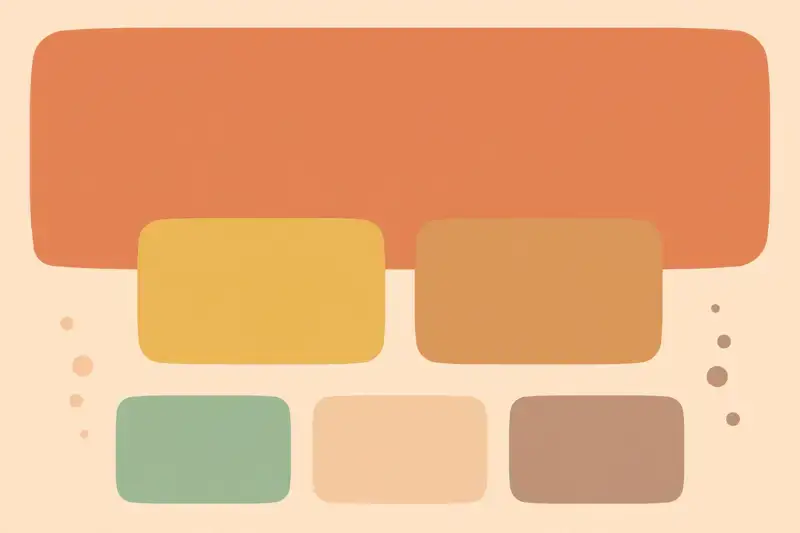
Beginners use every color. Professionals use three: a dominant color, a supporting color, and an accent for the important bits. A limited palette looks intentional and premium; a rainbow looks like a candy store exploded.
Pick colors with jobs. Dark text on light backgrounds for readability. One bold accent color reserved for calls to action, so the button is the only bright thing on the page. Muted backgrounds that let content shine. When everything is colorful, nothing is.
Check contrast. Light gray text on white may look elegant to you and be invisible to half your viewers. If people cannot read it, the design failed. There are free contrast checkers; use one. Accessibility is not optional polish, it is the job.
Lesson 7
Professional design is mostly consistency: the same headline style on every page, the same button shape, the same spacing rhythm, the same image treatment. The viewer never notices consistency consciously, but they feel the polish. Inconsistency, meanwhile, is instantly visible.
Build yourself a mini style guide, even for a one-page flyer: headline font and size, body font and size, your three colors, your spacing rule. Write it down. Then follow it everywhere. Future you will thank present you, and multi-page projects will hold together.
This is also why templates work. Starting from a good template and customizing consistently beats starting from scratch inconsistently. There is no prize for originality in spacing.
Lesson 8
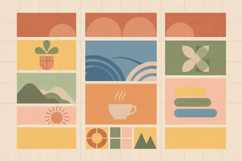
Behind every clean layout is a grid: invisible columns that everything snaps to. Magazines, websites, posters, all built on grids. The grid is why professional layouts feel orderly even when they are full of stuff. Learn to see it and your layouts will click into place.
Start simple: divide your page into three or four equal columns. Let headlines span all columns, body text sit in two, images in one or two. Suddenly everything has a place. The grid does the deciding for you, which is exactly the point.
Lesson 9
One great image beats six mediocre ones. Beginners sprinkle small clip-art-style images everywhere; professionals use one strong image, big, with room to breathe. Images are the most powerful element on the page, so give them the space their power deserves.
Choose images that support the message, not just decorate. A photo of real people doing the real thing beats a stock photo of models pretending. And size matters: small images look like afterthoughts. If an image is worth including, it is worth making prominent.
Watch out for stretched, pixelated, or watermarked images. Nothing kills credibility faster. Use high-resolution files, keep proportions locked when resizing, and never steal images you do not have rights to use.
Lesson 10
Every designer learns by studying other designers. Find work you admire and ask: why does this work? Where is the hierarchy? How much whitespace? What is the grid? Then borrow the structure for your own content. This is how the whole field advances, and it is completely legitimate.
Build a swipe file: screenshots of great flyers, websites, posters, packaging. When you start a project, flip through it for structural ideas. Starting from a proven structure and filling it with your own message is smart, not cheating. Cheating is copying the actual words and images.
Over time, the borrowed structures blend into your own style. Style is just the sum of everything you have stolen and transformed. Everyone's is. The designers you admire did exactly this.
Lesson 11
"What do you think?" gets you "looks good!" which teaches you nothing. Ask specific questions instead: "What do you notice first?" "What would you click?" "Is anything hard to read?" Specific questions get specific answers, and specific answers make your design better.
Watch people use it rather than asking their opinion. Hand someone the flyer and watch where their eyes go. Show the webpage for five seconds, hide it, and ask what they remember. Behavior beats opinion every time.

Lesson 12
Time to make something. Design a poster for a real or imaginary event: a concert, a bake sale, a workshop. One page. Apply the course: clear message first, generous whitespace, everything aligned, two fonts, three colors, one strong image, obvious hierarchy.
Then get feedback with specific questions, revise once, and call it done. Done is the goal, not perfect. Your first poster will have flaws, and that is fine. The tenth will be genuinely good.
Save your work. In six months, look back at this first piece and you will see exactly how far you have come. That feeling is the real diploma.
Graduation
You now think like a designer: message first, whitespace as a tool, everything aligned, two fonts, clear hierarchy, small palettes, relentless consistency, invisible grids, fewer but bigger images, stolen structures, and feedback that actually helps. Apply this to anything, a resume, a slide deck, a birthday invitation, and it will look intentional. Because now it is.
Keep learning
This course is part of Starvard University, striving for greatness.