Starvard University · Statistics
Don't get fooled by numbers. Averages, probability, correlation, sampling, and all the ways charts lie to you, explained in plain English.

The whole course in brief
Twelve lessons, twelve big ideas.
The twelve lessons
Lesson 1
Every day you are hit with numbers making claims: poll results, medical risks, investment returns, crime stats, "9 out of 10 dentists." Most people absorb them passively and update their beliefs. This course teaches the opposite move: pause, interrogate the number, and ask the five questions that deflate most statistical nonsense.
The five questions: What exactly was measured? Who was measured, and who was left out? Compared to what? How big is the effect, really? And who benefits if I believe this? Keep those in your pocket and you are already harder to fool than most college graduates.
Lesson 2
"Average" is three different numbers wearing one trench coat. The mean is the total divided by the count. The median is the middle value when everything is lined up. The mode is the most common value. They can tell wildly different stories. In a bar with nine regulars and one billionaire, the mean wealth is enormous and the median is ordinary. Which one describes "the typical person"?
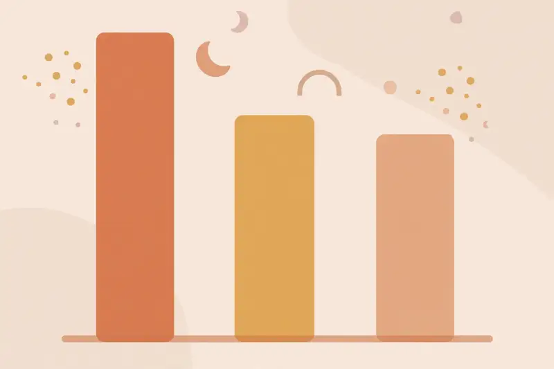
Rule of thumb: for income, home prices, and anything with outliers, the median is the honest number. For anything symmetric and well-behaved, the mean is fine. Whenever someone says "average" without saying which, assume they picked the one that helps their case, and ask for the other.
Lesson 3
Two classrooms can both average 75 on the test while being completely different: one where everyone scored near 75, another where half aced it and half failed. The average hides the shape. Spread, measured as range or standard deviation, tells you how bunched or scattered the numbers are.
This matters everywhere. An investment averaging 8% a year with wild swings is a different beast than one averaging 8% steadily. A medicine that helps "on average" might help most people a little or a few people a lot. Whenever a number describes a group, ask for the spread before you decide what it means for you.
Lesson 4
Probability sounds mathematical, but at its core it is counting: how many ways can it happen, out of how many total possibilities? A coin flip is 1 out of 2. The chance of a rare disease is the number of cases divided by the population. Most probability mistakes are counting mistakes.
The biggest one is ignoring base rates. A test that is "99% accurate" sounds decisive, but if the disease hits 1 person in 10,000, most positive results are false alarms, because the huge healthy population generates more errors than the tiny sick population generates true hits. Doctors, courts, and hiring managers get this wrong constantly. When you hear a scary percentage, ask: out of how many?
Lesson 5
Two things moving together does not mean one causes the other. Ice cream sales and drownings rise together every summer; the cause is heat, not dessert. Nicholas Cage movies correlate with pool drownings. The classic trap is the hidden third variable driving both.
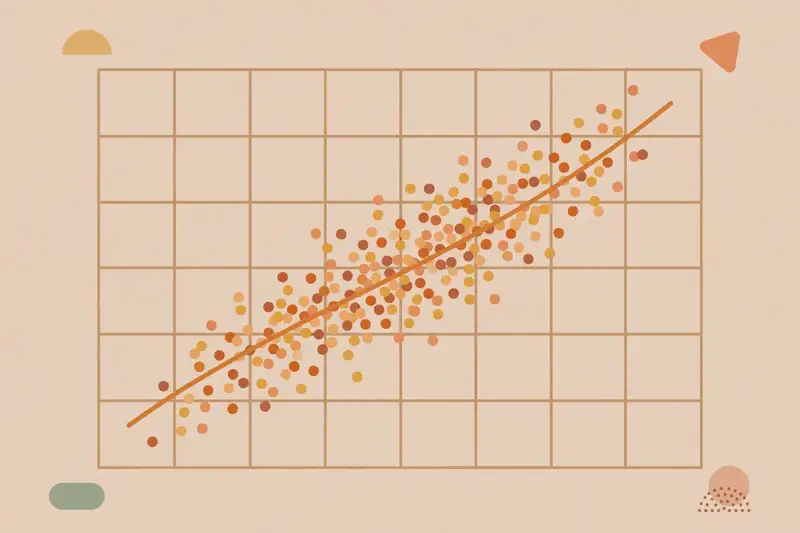
To show causation you need more: the cause must come before the effect, alternative explanations must be ruled out, and ideally you need a real experiment with a control group. Headlines skip all of this. When you read "linked to" or "associated with," translate it to "moved together with, cause unknown," and you will be right most of the time.
Lesson 6
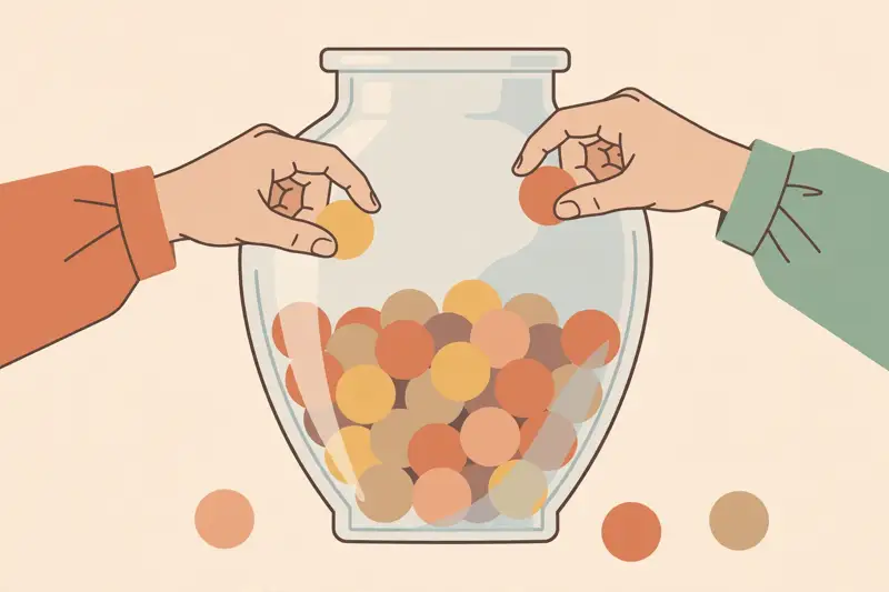
Flip a coin ten times and you might get 8 heads. Flip it ten thousand times and you will get very close to half. Small samples are noisy; big samples settle down. This is the law of large numbers, and ignoring it is why people see patterns in noise: the "hot hand" in basketball, the lucky stock picker, the town with the amazing cancer cluster that turns out to be random variation in a tiny population.
Practical rule: extraordinary claims from tiny samples deserve extraordinary skepticism. "I tried it and it worked" is a sample of one. Before you change your beliefs, your diet, or your investments on a story, ask how many observations stand behind it.
Lesson 7
A good poll of 1,000 randomly chosen people can represent a whole country within a few percentage points. That feels like magic, but it is math: random sampling means every person had a fair chance of being picked, so the sample mirrors the population. The magic word is random. Without it, the numbers are decoration.
Polls fail when the sample is not random (online opt-in polls), when certain people refuse to answer (nonresponse bias), when questions are worded to push (framing), or when people misreport (nobody admits the embarrassing answer). The margin of error only covers random sampling noise, not these bigger problems. Read the methodology paragraph before the headline.
Lesson 8
"This doubles your risk!" sounds terrifying until you learn the risk went from 1 in 10,000 to 2 in 10,000. Relative change (100% increase) hides the absolute size (one extra case per ten thousand). Marketers, activists, and headline writers almost always report the relative number because it sounds bigger.
Always convert to absolute terms: how many out of how many, before and after? A drug that cuts risk "by 50%" might take you from 2% to 1%, which is real but modest. The honest number is the absolute one. Demand it.
Lesson 9
"Studies show" is doing a lot of heavy lifting in modern discourse. Before believing one, run the checklist: Was it a randomized experiment or just an observation? How big was the sample? Was it done on people like you (mice are not people)? Has it been replicated? Who funded it? A single small observational study funded by the company selling the product is a press release, not a finding.
Also watch for the file drawer problem: studies that find nothing tend not to get published, so the published record skews positive. And remember that one study is never the story. Science is the slow accumulation of evidence. Wait for the pattern, not the headline.
Lesson 10
Extreme performances tend to drift back toward average on their own. The rookie who had an unbelievable first season usually cools off. The terrible quarter is usually followed by a better one. This is not a curse or a comeback story; it is statistics. Extremes are partly luck, and luck does not repeat.
This explains so much bad reasoning. The pilot scolded after a bad landing flies better next time, so the scolding "worked," except the good landing after a great one gets no praise and the praise "did nothing." Coaches, bosses, and parents constantly mistake regression for the effect of their feedback. Before you credit the intervention, ask: would it have drifted back anyway?
Lesson 11
Charts feel objective, which makes them perfect lying tools. The classics: the truncated y-axis, where a bar chart starts at 90 instead of 0 to make a tiny change look enormous. The cherry-picked timeframe, starting the line right after a dip. The area trick, where a doubled value is shown with a doubled height AND width, making it look four times bigger. And the dual axes, scaled to manufacture any correlation you want.
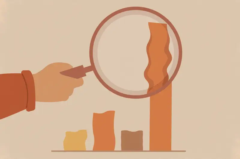
Defense is simple: check where the axis starts, check the timeframe, and ask whether the visual matches the numbers. A chart should make the truth clearer. If it makes a small thing look big, it is advertising, not information.
Lesson 12
"Statistically significant" has a technical meaning: the result is unlikely to be pure chance. It does NOT mean big, important, or worth acting on. With a huge sample, a trivial difference becomes "significant." A drug can significantly reduce symptoms by an amount no patient would notice.
So the final questions of the course, the ones to ask about every finding: How big is the effect in real terms? Does it matter to a human life? And what would it cost to act on it? Statistics tells you what is unlikely to be noise. Judgment tells you what is worth doing. You now have both.
Graduation
You have the toolkit: which average, how much spread, out of how many, correlation is not causation, random or it didn't happen, absolute not relative, one study is not the story, extremes regress, charts lie, and significant is not important. Most statistical manipulation relies on you not asking these questions. Now you ask them automatically. That is the whole game.
Keep learning
This course is part of Starvard University, striving for greatness.