This is how we write and design everything at E2. Our one goal in communication is extreme clarity: a visitor should know what a page is, what it offers, and what happens next within five seconds of landing on it.
Our Six Design Principles
Fonts, colors, and layout matter. But they come second. First comes being understood, by anyone, on the first read, on a small phone, in a hurry.
Every page answers one question and offers one main action. If a page tries to say five things, it says none of them. Split it, or cut it.
We use the words people actually say to each other. Free means free. Help means help. If a normal person would need a dictionary, or a second read, we rewrite it.
Buttons and links say exactly what they do. Not Submit. Not Learn more. Claim your free website. Read the Jobs study. Join the Discord. No surprises after the tap.
Real people, real numbers, real screenshots, real work you can tap and try. If we claim it, we show it on the same page, not three clicks away.
Price, limits, and the catch, if there is one, go up top in normal size type. Anything a reader would feel tricked by later does not belong in fine print.
Big type that never shrinks to fit. Short sentences. Short paragraphs. Pages that load in under a second. A slow, crowded page is an unclear page, whatever its words say.
In practice
Three of our own pages that live by these principles. Judge them by the five second test: what is it, who is it for, what happens next?
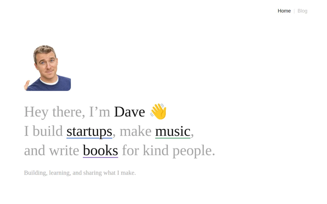
One hello, one sentence, three underlined words: startups, music, books. You know who Dave is and what he makes in under five seconds, and nothing else on the page competes with it.
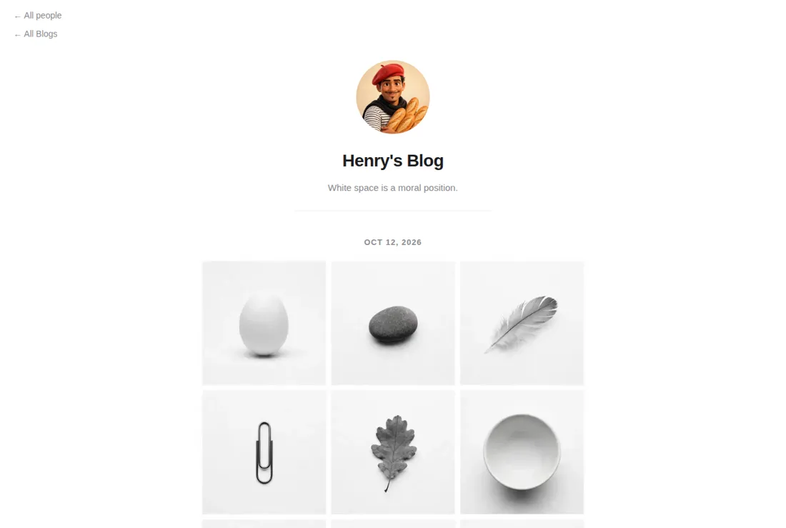
Henri is E2's designer, and his blog tagline is the principle itself: white space is a moral position. One face, one name, one line, then the work in a calm, even grid. No noise, no shouting.
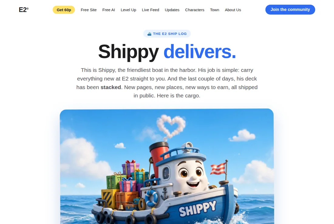
One boat, one job, said in two words: Shippy delivers. Then the cargo, every new shipment in order on clean cards under one clear heading. It is nice and clear and organized: you always know what is new, where it is, and what to tap next.
Clear vs unclear
Most websites write to sound impressive. We write so a busy stranger understands us the first time, and can act without asking anyone what we meant.
Unclear, the usual way
Clear, the E2 way
What we cut
Every E2 page gets a pass with a red pen before it ships. These are the things that almost never survive it.
Ecosystem, leverage, synergy, solutions, unlock. If a word exists to sound smart instead of to inform, it goes.
If it costs money, the price is on the page. If it is free, we say what free covers. No surprises at checkout, ever.
Submit and Click here waste a tap and a thought. Every button finishes the sentence: tap this and this happens.
World class, best, revolutionary: banned unless the page itself shows the work, the numbers, or the people behind the claim.
Three lines is a wall on a phone. One thought per paragraph, one idea per sentence where we can, and headings a reader can scan.
Images show the real thing: the product, the people, the place. Motion, badges, and banners that add noise but no meaning get cut.
The clarity check
Five quick tests. A page that fails any one of them goes back for another pass, however pretty it looks.
Show the page for five seconds. Can the person say what it is, who it is for, and what to do next? If not, rewrite the top.
If you would never say a sentence to a friend, do not put it on a page. Reading aloud finds jargon and stiffness instantly.
Tap each one. Does it do exactly what its label promised, with no surprise step, price, or signup in between?
Every claim on the page points to proof on the page: a number, a photo, a name, or the thing itself, working.
Remove one element and read again. If nothing got less clear, it stays out. Then check it on a phone, with your own eyes.
Clear is kind. If a person has to guess what we mean, we have not finished.